The Return of the Challenge: Tokyo Drift
The end of the "Challenge" trilogy of tech difficulties with my blog, ending on the least difficult note of final style changes and how I learned loopback addresses.
In “Challenge Take Two” I commented on the sometimes frustrating gap between what instruction material thinks is obvious and what I think is obvious as a learning student. I didn’t start making “A Work in Progress _” thinking I would learn so much from it specifically, but here I am writing the third installment.
A lot of the early steps were me following directions - the Chirpy tutorial page, Gemini, Claude, Markdown keys, etc - so concepts I didn’t quite grasp I let go. Trying to hold on to everything all at once is a good way to break my grasp on everything entirely, rather than ensuring retainment. One of the questions that sat with me the longest was the Chirpy tutorial page saying that when you run the budle exec jekyll serve command, you can go to http://127.0.0.1:4000/ to review the changes before pushing them to the repo to go live on the blog.
How could everybody use the same url?
Today, I opened my Network+ CompTIA module I was working on, by far the heaviest of the CompTIA courses I’m running through, and the very first thing I open to is “loopback addresses.” I read through the page three times before finally getting frustrated. I open Claude and asked it to use an analogy to explain the concept for me - I already have general directions when I open chats in that specific project to not assume what’s obvious because I’d rather have it tell me information I do know and understand than leave it out entirely. Also, if I came in with a problem or we worked on scripting even for my personal projects, to try to relate things back to concepts in my CompTIA courses. At the end of a session when I want to retire that chat, I ask Claude for a dev log summary of what we did, the problems, the solutions, the whys, and the relevant concepts.
We go back and forth on looback addresses and I’m sort of getting the concept using a multiline phone system, that it’s the code that lets you test that you can make a call without tying up any of the internal or external phone lines. It doesn’t feel perfect but it was better than what I started with.
Later that night, I decide to take a break and update my blog. The thought about the preview url pops into my head again and my internal voice goes “I wonder if it has something to do with ports.” The bundle command finishes running, I open the preview and VS Code informs me it’s forwarding it to Port 4000.
Oh. Oh, something’s happening here. In my brain. Neurons are firing, connections are being made, I’m clearly learning. So I pull up that Claude chat again and relay this same information and Claude says yes, but the port number isn’t what really matters and points to the first part of the url. 127.0.0.1. I could facepalm.
I’d been using a loopback address this entire time! The “button” on the phone that says “test this without it leaving this phone.” That’s why everyone can use that url because it’s only ever going to be on their device. And, like, I’m explaining this and it feels so rudimentary. I have these hypothetical tenure IT people in my head going “why is learning this so exciting?” But I remind myself that they’re not real and of course I should be excited that something conceptual is now concrete and I know it well enough that I can kind of explain it and recognize it in action.
If this question I knew I wouldn’t be able to grasp three weeks ago can come back and feel answered cleanly now, then I’m doing something right. I’m not blindly following directions, I’m trusting trail guides and taking notes so I’m less likely to get lost the next time through.
Now let us finalize the trilogy with my last few changes that I’ve made since my second post. There weren’t quite as many technical issues this time so this will be pretty straight forward. But if this helps someone, all the better. The following is a combo of my writing and portions of the dev log summary Claude made for me.
Dev Log: Finishing Touches on A Work In Progress _
1. Custom Fonts
What I wanted
A heading font with a retro/tech feel paired with a body font that had that early-2000s analog warmth - think the blobjects style. After looking at mockups of Orbitron, Exo 2, Rajdhani, and Russo One against IBM Plex Sans for body text, I landed on Exo 2 + IBM Plex Sans.
The problem
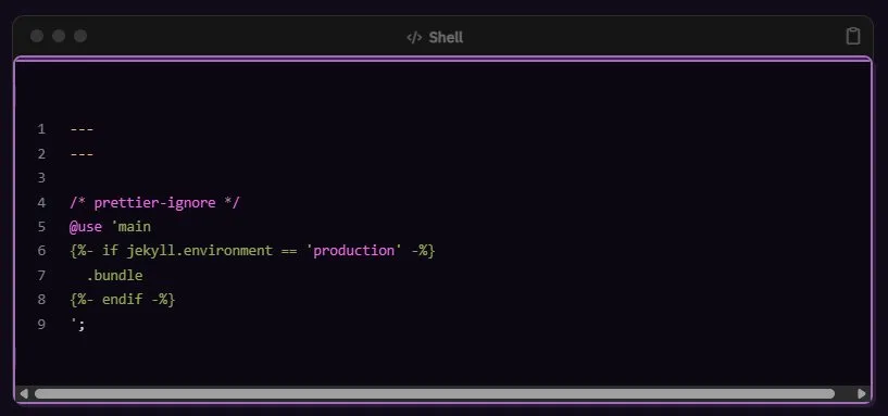
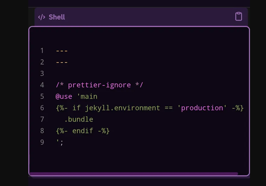
My first instinct was to load Google Fonts via @import url() inside the SCSS file:
1
@import url('https://fonts.googleapis.com/css2?family=Exo+2...');
This broke the entire site and produced a blank page with just:
1
--- layout: home # Index page ---
Why it broke (according to Claude)
Jekyll’s SCSS compiler chokes on @import url() syntax inside .scss files — it tries to parse it as a Sass import rather than a CSS one. External URLs belong in HTML, not SCSS.
The fix
Load Google Fonts via the HTML <head> instead. Since Chirpy is loaded as a gem, you need to copy the head include out of the gem and into your repo so you can modify it:
1
mkdir -p _includes && cp /usr/local/rvm/gems/default/gems/jekyll-theme-chirpy-7.5.0/_includes/head.html _includes/head.html
Then add the Google Fonts link just before </head>:
1
<link href="https://fonts.googleapis.com/css2?family=Exo+2:wght@400;700&family=IBM+Plex+Sans:ital,wght@0,400;0,500;1,400&display=swap" rel="stylesheet">
Then in the SCSS, just reference the fonts by name — no import needed:
1
2
3
4
5
6
7
8
9
10
11
12
13
14
15
16
/* === FONTS === */
html {
  --font-heading: 'Exo 2', sans-serif;
  --font-body: 'IBM Plex Sans', sans-serif;
}

body {
  font-family: var(--font-body) !important;
}

h1, h2, h3, h4, h5, h6,
.site-title,
.site-title a,
.post-preview .post-title {
  font-family: var(--font-heading) !important;
}
Transferable concept (according to Claude)
Any time you want to load external resources (fonts, icon libraries, etc.) in a Jekyll/Chirpy setup, put them in _includes/head.html, not in SCSS. If a theme file doesn’t exist in your repo yet, copy it out of the gem first — Jekyll will use your local copy over the gem’s version automatically.
Note from me: This is similar to the issue and solution needed for Jekyll to read my .scss file in the first place. The thing that the Chirpy tutorial kind of takes as really obvious when, in fact, it was not obvious to me. The “starter” pack they built doesn’t copy everything needed to work on and customize the blog theme. Probably because they don’t want to overwhelm people with options. They keep back files that if messed with could break things royally; someone that knows to go and pull those files probably already knows enough that any breakage is their fault, not Chirpy.
2. Analytics with Goatcounter
What I wanted
Page view tracking without the complexity of Google Analytics, without ads, and without GDPR headaches. Goatcounter is free, privacy-respecting, and has no cookies or tracking scripts beyond a simple page count.
Setup
Sign up at goatcounter.com — your chosen site code becomes
yourcode.goatcounter.comand is also your IDIn
_config.yml, find the analytics section and add just the code (not the full URL):
1
2
3
4
5
analytics:
  google:
    id:
  goatcounter:
    id: yourcode
Chirpy constructs the full URL itself — just the code goes in the config.
Production only
Goatcounter only fires when JEKYLL_ENV=production, which is exactly what GitHub Actions sets during deployment. Local development traffic is automatically excluded — no extra config needed.
Excluding your own visits
Visiting https://[username].github.io#toggle-goatcounter sets an opt-out flag in your browser’s localStorage. A confirmation message appears on the page when it’s set.
Important caveats:
- This is per browser, per device — it doesn’t sync through your Google account
- It persists until you clear localStorage
- You need to do it separately in every browser you use to visit your site
- Incognito windows don’t share localStorage with your regular session, so don’t bother opting out there
Transferable concept (according to Claude)
The #toggle-goatcounter pattern is a clean example of using URL fragments plus localStorage for user-controlled preferences without any backend. The same pattern appears in other privacy-respecting tools — worth knowing it exists.
3. Comments with Giscus
What I wanted
Comments that fit a technical blog on GitHub Pages — ideally stored somewhere I control, without ads or third-party tracking. Giscus uses GitHub Discussions as its backend, meaning comments live in your repo.
Setup steps
1. Enable GitHub Discussions on your repo: Settings → Features → check Discussions.
2. Install the Giscus GitHub app: Go to github.com/apps/giscus, install it, and give it access to your blog repo specifically.
3. Get your IDs from giscus.app: Fill in the configuration form at giscus.app. The settings I chose:
- Mapping:
pathname— each post URL gets its own discussion thread - Category:
Announcements— only you can create these, which prevents spam threads - Input position:
top— comment box above existing comments, more inviting - Reactions: enabled — low-effort engagement that doesn’t require writing a full comment
- Lazy loading: enabled — comments don’t load until the user scrolls to them, better page performance
- Metadata emit: disabled — only useful for custom integrations, no benefit for a standard blog
4. Fill in _config.yml:
1
2
3
4
5
6
7
8
9
10
11
12
comments:
  provider: giscus
  giscus:
    repo: username/username.github.io
    repo_id: # from giscus.app
    category: Announcements
    category_id: # from giscus.app
    mapping: pathname
    strict: 0
    input_position: top
    lang:
    reactions_enabled: 1
The theme problem
Chirpy hardcodes the Giscus theme in JavaScript — dark_dimmed for dark mode — and ignores any theme key in _config.yml. To change it, you need to find and override the source file.
Locating the file:
1
grep -r "dark_dimmed" /usr/local/rvm/gems/default/gems/jekyll-theme-chirpy-7.5.0/
This returned _includes/comments/giscus.html. Copy it out:
1
mkdir -p _includes/comments && cp /usr/local/rvm/gems/default/gems/jekyll-theme-chirpy-7.5.0/_includes/comments/giscus.html _includes/comments/giscus.html
Then find this line in the copied file:
1
const themeMapper = Theme.getThemeMapper('light', 'dark_dimmed');
And change dark_dimmed to your preferred theme, e.g.:
1
const themeMapper = Theme.getThemeMapper('light', 'transparent_dark');
Available Giscus themes include: light, dark, dark_dimmed, transparent_dark, noborder_dark, dark_high_contrast, and others listed at giscus.app.
Transferable concept (according to Claude)
When a gem-based Jekyll theme ignores a config option you expect to work, the answer is usually to copy the relevant include or layout file out of the gem into your repo and modify it directly. Jekyll always prefers files in your repo over files in the gem. Use grep -r "the thing you want to change" on the gem path to find which file to copy.
4. Custom Code Block Styling
What I wanted
Code blocks that felt intentional and matched the vaporwave palette — inspired by early 90s/Y2K OS window aesthetics with soft rounded borders and that slightly plastic, raised UI feel.
The approach
Chirpy already renders a nice code block header with a language label, copy button, and three decorative circles in the top-left corner. Rather than replacing this, I worked with it.
The SCSS
1
2
3
4
5
6
7
8
9
10
11
12
13
14
15
16
17
18
19
20
21
22
23
24
25
26
27
28
29
30
31
32
33
34
35
36
37
38
39
40
41
42
43
44
45
46
47
48
49
50
51
52
53
54
55
56
57
58
59
60
61
62
63
64
65
66
67
68
69
70
71
/* === CODE BLOCKS === */
.highlight {
  background-color: #0d0714 !important;
  border: 2px solid #4a1a5a !important;
  border-radius: 8px !important;
  box-shadow: 4px 4px 0px #2a1a3a !important;
}

/* Code block header bar */
div.code-header {
  background-color: #2a1a3a !important;
  border-bottom: 1px solid #4a1a5a !important;
  border-radius: 6px 6px 0 0 !important;
}

/* Code block text */
.highlight code,
.highlight pre {
  color: #e8e0f0 !important;
}

/* Inline code */
:not(pre) > code {
  background-color: #1a1025 !important;
  color: #ff71ce !important;
  border-radius: 4px !important;
  border: 1px solid #2a1a3a !important;
}

/* Scrollbar */
.highlight::-webkit-scrollbar {
  height: 6px !important;
}

.highlight::-webkit-scrollbar-track {
  background: #0d0714 !important;
  border-radius: 0 0 6px 6px !important;
}

.highlight::-webkit-scrollbar-thumb {
  background: #4a1a5a !important;
  border-radius: 3px !important;
}

.highlight::-webkit-scrollbar-thumb:hover {
  background: #ff71ce !important;
}

/* Language label icon */
div.code-header span[data-label-text] i {
  color: #9d6fb5 !important;
}

div.code-header span[data-label-text]::after {
  color: #9d6fb5 !important;
}

/* Copy button */
div.code-header button[aria-label='copy'] i {
  color: #9d6fb5 !important;
}

div.code-header button[aria-label='copy']:hover i {
  color: #ff71ce !important;
}

/* Traffic light circles — vaporwave edition */
div.code-header::before {
  --code-header-muted-color: #9d6fb5 !important;
  box-shadow: 1.25rem 0 0 #ff71ce, 2.5rem 0 0 #01cdfe !important;
}
Problems encountered
Fake title bar attempt: My first instinct was to add a ::before pseudo-element to .highlight to create a retro title bar. This created a double-header effect because Chirpy already renders its own header — the fake bar stacked on top of it and looked broken rather than intentional. Lesson: check what the theme already renders before adding new elements.
Targeting the language label: The language label (e.g. “Shell”, “Plaintext”) isn’t plain text — it’s a Font Awesome icon inside a <span data-label-text="Shell"> with the actual text injected via CSS ::after. Neither a simple color on the span nor targeting .lang worked. DevTools inspection revealed the structure:
1
2
3
<span data-label-text="Shell">
  <i class="fas fa-code fa-fw small"></i>
</span>
The fix was targeting both the icon and the pseudo-element:
1
2
div.code-header span[data-label-text] i { ... }
div.code-header span[data-label-text]::after { ... }
The traffic light circles: All three circles are generated by a single ::before pseudo-element using box-shadow offsets to create the appearance of three separate dots. You can’t target them individually with CSS — they’re one element. The color is controlled by a CSS custom property --code-header-muted-color. To give each circle a different color, override the box-shadow directly with explicit color values for each offset:
1
2
3
4
div.code-header::before {
  --code-header-muted-color: #9d6fb5 !important; /* first circle */
  box-shadow: 1.25rem 0 0 #ff71ce, 2.5rem 0 0 #01cdfe !important; /* second and third */
}
Note: Above code may not be the exact colors I’m using on the site as you’re visiting currently
Transferable concept (According to Claude)
When you can’t figure out what’s generating a visual element or why your selector isn’t working, DevTools is your best friend. The workflow that worked repeatedly throughout this process: Elements tab → click the thing → check Computed styles for what property is actually controlling → check Styles panel to find which file and line is setting it → write your override to target that specific property with that specific selector.
CSS attribute selectors like [data-label-text] and [aria-label=’copy’] are underused but powerful — they let you target elements by their data attributes rather than relying on class names that might change between theme versions.
The Future
Of course thats not going to be the final update. I recently checked the site in my phone and the code block header doesn’t quite fully get colored. Not the end of the world but will be nice to fix. I also want to look into RSS feeds and ways to get notification when a new post goes up - not just for others on my blog, but so I can follow others.
But for now I’m calling the blog project buttoned.
Tune in to learn more about how my server is going and my writing inspiration script project!
…
A Surprise Epilogue!
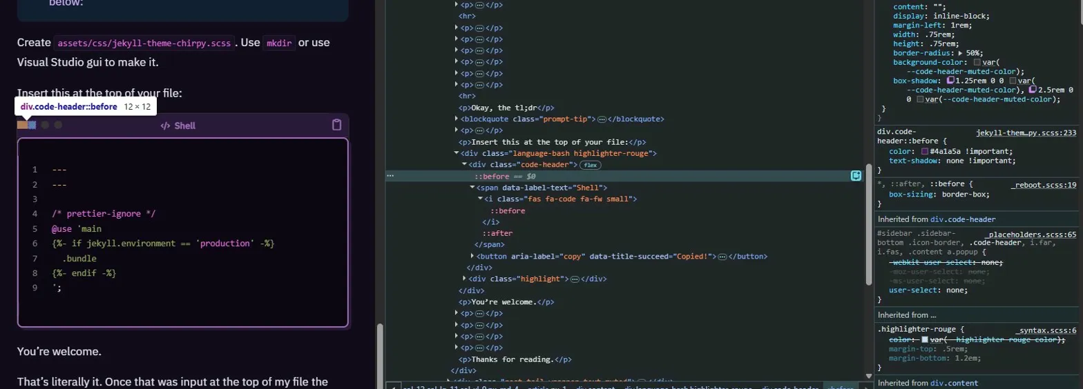
Heh. So funny story. I was putting the final touches on this post, checking that it looked alright on the preview and I paused and went “why am I talking about that code in this post?” And then I realized it was a screenshot from my blog that I put in there intentionally to demonstrate some of the hiccups in the development.
So a new final minute project began.
5. Image Style Window
What I wanted
For screenshots and other images to stand out against the site so it would be readable as photos, especially when they were screenshots of the blog page - those blend in.
The Options
- Drop shadow — subtle but effective:
1
2
  box-shadow: 4px 4px 0px #2a1a3a, 0 0 0 2px #4a1a5a !important;
  border-radius: 6px !important;
- Neon border — leans into the vaporwave aesthetic, makes screenshots feel intentional:
1
2
3
  border: 2px solid #4a1a5a !important;
  border-radius: 6px !important;
  box-shadow: 0 0 8px rgba(255, 113, 206, 0.3) !important;
Retro window frame — give screenshots the same treatment with a header bar pseudo-element as the code headers, more involved.
- For the specific screenshots-of-the-site problem — adding a light colored caption or a visible border/frame around just those images rather than all images sitewide might be cleaner than a global style change. (Rejected immediately)
The Solution - Retro Window Frame
Step 1 — Create the include file:
1
touch _includes/retro-img.html
Step 2 — Add this to _includes/retro-img.html
1
2
3
4
5
6
7
<div class="retro-frame">
  <div class="retro-frame-header">
    <span class="retro-frame-dots"></span>
    <span class="retro-frame-title">image</span>
  </div>
  <img src="" alt="" />
</div>
Step 3 — Add the styling to the SCSS:
1
2
3
4
5
6
7
8
9
10
11
12
13
14
15
16
17
18
19
20
21
22
23
24
25
26
27
28
29
30
31
32
33
34
35
36
37
38
39
40
/* === RETRO IMAGE FRAME === */
.retro-frame {
  border: 2px solid #4a1a5a;
  border-radius: 8px;
  overflow: hidden;
  margin: 1.5rem 0;
  box-shadow: 4px 4px 0px #2a1a3a;
}

.retro-frame-header {
  background-color: #2a1a3a;
  border-bottom: 1px solid #4a1a5a;
  padding: 4px 12px;
  display: flex;
  align-items: center;
  gap: 8px;
}

.retro-frame-title {
  color: #9d6fb5;
  font-size: 12px;
  font-family: 'IBM Plex Sans', sans-serif;
}

.retro-frame-dots::before {
  content: '';
  display: inline-block;
  width: 0.75rem;
  height: 0.75rem;
  border-radius: 50%;
  background-color: #9d6fb5;
  box-shadow: 1.25rem 0 0 #ff71ce, 2.5rem 0 0 #01cdfe;
  margin-right: 2.5rem;
}

.retro-frame img {
  display: block;
  width: 100%;
  margin: 0;
}
Step 4 — Use it in posts like this:
1
{% include retro-img.html src="/assets/img/posts/your-image.png" alt="description" title="screenshot.png" %}
The Upgrade
The first creation was fine and worked immediately, but still blended into the site since it looked nearly identical to code blocks. Adjust the aesthetic to a more browser looking design and shift the colours some.
Leave _includes/retro-img.html, and create a new _includes/browser-img.html
1
2
3
4
5
6
7
<div class="browser-frame">
  <div class="browser-frame-header">
    <span class="browser-frame-dots"></span>
    <span class="browser-frame-url">a-work-in-progress.dev</span>
  </div>
  <img src="" alt="" />
</div>
Add to Scss
1
2
3
4
5
6
7
8
9
10
11
12
13
14
15
16
17
18
19
20
21
22
23
24
25
26
27
28
29
30
31
32
33
34
35
36
37
38
39
40
41
42
43
44
45
46
47
/* === BROWSER IMAGE FRAME === */
.browser-frame {
  border: 2px solid #4a1a5a;
  border-radius: 8px;
  overflow: hidden;
  margin: 1.5rem 0;
  box-shadow: 4px 4px 0px #2a1a3a;
}

.browser-frame-header {
  background-color: #1a0f2e;
  border-bottom: 1px solid #4a1a5a;
  padding: 6px 12px;
  display: flex;
  align-items: center;
  gap: 12px;
}

.browser-frame-dots::before {
  content: '';
  display: inline-block;
  width: 0.75rem;
  height: 0.75rem;
  border-radius: 50%;
  background-color: #9d6fb5;
  box-shadow: 1.25rem 0 0 #ff71ce, 2.5rem 0 0 #01cdfe;
  margin-right: 2.5rem;
  flex-shrink: 0;
}

.browser-frame-url {
  background-color: #120b1a;
  color: #9d6fb5;
  font-size: 11px;
  font-family: 'IBM Plex Sans', sans-serif;
  padding: 3px 12px;
  border-radius: 20px;
  border: 1px solid #2a1a3a;
  flex: 1;
  text-align: center;
}

.browser-frame img {
  display: block;
  width: 100%;
  margin: 0;
}
Use in posts
1
{% include browser-img.html src="/assets/img/posts/your-image.png" alt="description" %}
Voila.
To get
liquidcode to appear in the code box, wrap your code markdowns with a raw tag before the opening backticks and an endraw tag after the closing backticks: Shopify’s Liquid documentation